We start by explaining the more commonly use variable control chart that is X-R Control Chart. Also known as X-bar & R chart. X or X-bar stand for average whereas R stands for Range
Below table is 1 month data of rod diameter measure 5 pieces daily using vernier caliper.
Below table is 1 month data of rod diameter measure 5 pieces daily using vernier caliper.

To plot a X-R chart we must first divide this data into subgroup A very simple consideration could be each day is consider a subgroup. This means we have a total of 30 subgroups for that month.
STEP 1: Subgroup - Average
Next for each subgroup, we calculate the average of the subgroup.

STEP 2: Subgroup - Range
Next for each subgroup, we calculate the range of the subgroup (maximum – minimum).

STEP 3: Construct the table for X-R
After calculate each subgroup average and range data we can construct a table as below.

STEP 4 Calculate Control Limit
Before plot the control chart we need to calculate the control limit for the X chart and R chart.

From above table, we can calculate

Coefficient for control chart can be obtained from appendix 1. In this case it is 0.577.
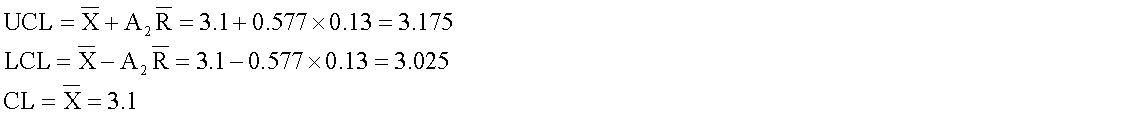
For R Chart,

Coefficient for control chart can be obtained from appendix 1. In this case it is 2.114 & 0 respectively.

Note: The data use to calculate the control limit normal should not be the same set of data that we use to plot the X-R chart. But for education purpose
First, plot X chart with data of each X (average) against the subgroup with control limit line for X chart as shown below

Notice that the X value fluctuated around the CL and all points are within the UCL and LCL. Such condition means that the process is stable. The UCL and LCL is calculated from the same data as X chart plot. It will always be within the UCL and LCL. The data use to calculate the UCL and LCL must be a process that is stable therefore the UCL and LCL can be use to evaluate abnormal situation
Next, plot R chart with data of each R (range) against the subgroup with control limit line for R Chart
Next, plot R chart with data of each R (range) against the subgroup with control limit line for R Chart
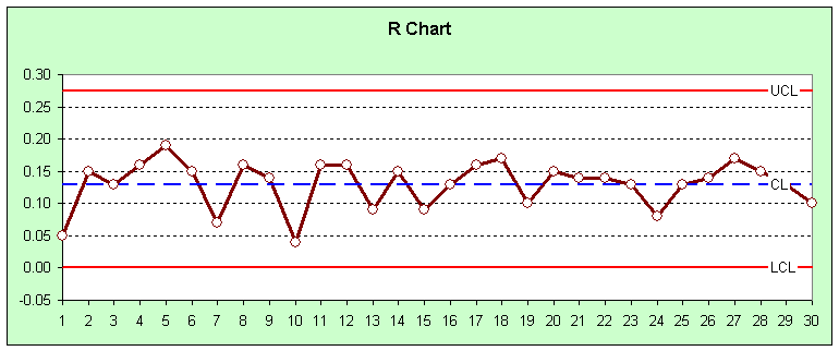
Similarly, the R chart point also falls within the UCL and LCL.
No comments:
Post a Comment